Hologic
Dodgeball Z
Other Projects
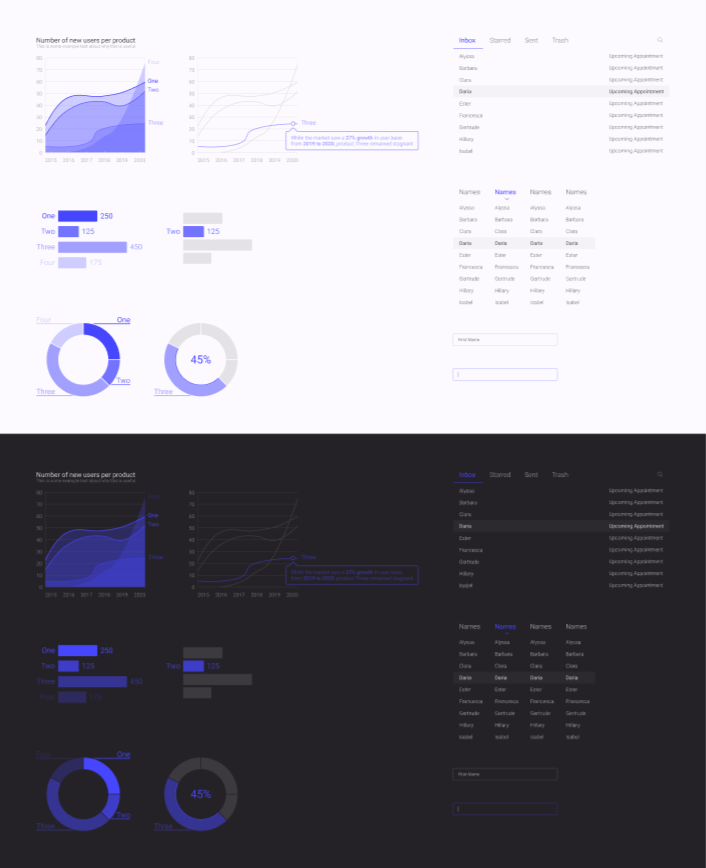
This comprehensive design system was developed between myself and two colleagues to be applied to all Hologic products, both retroactively and in the future.
I personally designed inboxes, tables, text fields, loading screens, and various data visualizations, and I created dark versions and coded prototypes for good measure.
To improve my designs, I read Storytelling with Data by Cole Nussbaumer Knaflic and took inspiration from her process.
Check out the Figma build in the link above, or check out some of my coded prototypes in Codepen!
As medical software, the Unifi™ mammography system is expected to be clean and sharp, exuding precision and accuracy.
However, this does not mean it must be intimidating to users.
To alleviate this issue, I designed and pitched a suite of animations that bridge the gap between precision and usability.
Each was crafted with the intention to show what an item can do or where it can go.
With these, Unifi™ will be more intuitive and display an attention to detail far above and beyond what is offered by the competition.
Download the presentation above!
Color to make cursors more visible in all settings.
This was done as part of the design process for cursors. I explored different widths and colors to see what can make the cursor stand out in any area with as little change to the current design as possible.Blue specified in the Hologic Style Guide is not visible on dark backgrounds.
While working on the design system, I found that the blue specified in the Hologic Style Guide does not match the other colors. Its luminosity is nowhere near as bright, leading to a nearly invisible shade on dark backgrounds. I used the other colors in the style guide to find a shade that better matches the rest and works in all backgrounds, then used this color for my designs.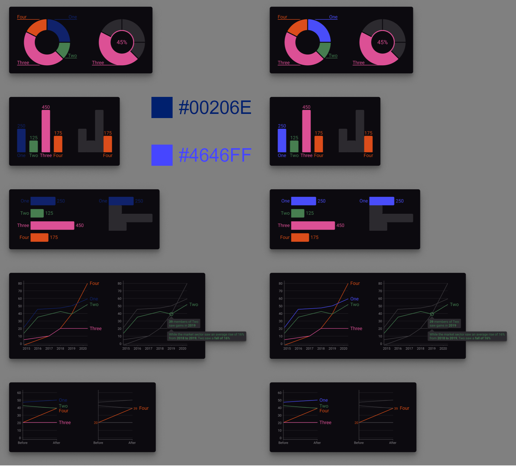
Read Storytelling with Data by Cole Nussbaumer Knaflic.
While working on data visualizations for the design system, my mentor Calvin recommended I read this book to help me create my designs. I read it during any downtime and finished within a week before implementing changes to my designs based on what I learned. It proved immensely helpful in creating a cleaner and more professional aesthetic.Selected tab signifiers.
This was an exploration of how a user perceives an array of tabs, and how to easily convey which is selected with as few added design elements as possible.
Cursor visibility.
Because Unifi™ was designed to display medical images requiring incredibly fine discernment of shades from black to white, it was found by users that cursors could easily be hidden depending on the background. After the research presentation, I found that a two-toned approach would be perfectly visible in all scenarios. A two-toned approach would force a thicker cursor overall, so I suggested a hole-punch design to prevent the cursor from obscuring elements behind it. I also suggested replacing white with the primary accent color so radiologists could easily pick it out from the grayscale background.Menu overflow.
This was made to solve an issue where the scrollbar was missing when titles would overflow in a bottom tray menu. Because of this, users were unaware of off-screen tabs. Rather than add two stacked scrollbars as asked which would not have an obvious signifier for their purpose, I added arrows on either end and a gradient fade on the text to imply continuation off screen, as shown in the Figma Builds section. The outlined arrows that already exist weren’t used as they would be hard to see in front of the text.Option not available notice.
These tickets were added to provide a signifier when color overlay or chest wall clipping buttons were disabled.Send and delete all annotations.
This addresses an issue where radiologists want to manipulate multiple items at once. One constraint with this one were time restraints on developers, forcing us to push a multi-select option to a later update. I also had to keep in mind the existence of preestablished workflows to not confuse old users.Patient study table.
With the incredible amount of information on each patient that radiologists need to see, living by the simplify mantra of designers was a difficult path. I had to find a way to show as much data as possible in a clean and understandable way.Minimize overlap of toolbar on image.
Images need to be unobstructed, which proved to be a problem with the floating toolbar. I had to find a way to keep the tools close at hand to radiologists without cluttering the screen or covering the image.Import error handling.
When importing images, there was no clear signifiers for the path needed to restart the download. From creating error icons to toasts to notifications, I created the necessary tools for the user to get back on track.
In one of my most memorable classes at the University of California, Irvine, we were tasked with creating a video game in ten weeks.
While our professor expected us to use premade assets to build our game, I convinced my team that this was an opportunity to make something really spectacular and decided to make all our assets myself.
Dodgeball Z is a top-down 2D dodgeball game where you, Melvin, are a nerd who wants payback on the school bullies.
With gameplay heavily inspired by games like Mega Man and Binding of Isaac, players can go through two levels and two bosses, dodging balls from every angle.
In the future, I plan to develop this concept into a full game where Melvin can gain new powerups by facing down teachers and other bosses.
Try the game now by clicking the download link above!
As part of the project, we were asked to make promotional materials for our game.
Once again, I took this as an opportunity and made a full website, hiding some easter eggs for perceptive players.
.gif)
The game features Melvin, who is controlled by the player and can walk around and throw dodgeballs.


Bully and Cheerleader are the two basic enemy types. Bullies will chase Melvin and throw dodgeballs while cheerleaders spin in place and throw pom-poms.

The Science Teacher can upgrade Melvin's dodgeballs, but does not have any attacks.

There is also the first boss, Hall Monitor who can deflect Melvin's attacks when he holds up his palm and can fire a spreadshot when he blows his whistle.
.gif)
The second and final boss in the game so far is the Student Body President, who can dash at Melvin and fire a volley of shots when she reads from her law book. Finally, there is the Cloaked Man who sets Melvin on his mission and the Principal who is planned to be a future boss. Download the sprite pack above!
I developed the music for the game in BeepBox, an online tool that allows users to create 8-bit music.
Retaliation, the main theme of the game is played on the title screen and throughout the first level. A faster version is played in the second level once Melvin gets his speed upgrade.
HALT! is played during the boss fight with the Hall Monitor.
Melvin Versus the Law is played during the boss fight with the Student Body President.
Consumed is the last song, planned for play when fighting the Principal. Download the song pack above!
I originally created these cards to show off my projects.
While I believe the cards are one of the more aesthetically pleasing components on the site, I needed a lot more space to show pictures and more detailed text than the small cards could allow.
Once I created this file-explorer page, the cards' use-case was obsolete and only served to distract visitors away from this page.
For now, I have set them aside, but I plan to use the components to create cards showing my design process in the near future.
When searching for a job just out of college, I quickly realized that proving yourself as a designer would need much more than a one-sheet résumé, so I got to work.
Within a couple weeks, I had an online portfolio I could be proud to show off.
I made a point to not use pre-built frameworks and only used Bootstrap to make my carousel viewer.
In hindsight, there is so much I would change now that I have more skills with JavaScript and a more refined approach to my designs, and I am shocked at how quickly my style is adapting to meet them.
Regardless, the experience I gained was an important stepping-stone in my journey as a designer.
When I was working as a radio show host at KUCI, I designed and developed graphics to promote my show, Djinn & Boba, along with a website to display playlists and engage listeners.
A team of five and myself were tasked with creating an app that makes a positive impact on the world. We chose to focus on emotional health, and designed a beta version of Vibes.
This progressive web app - developed with Angular JS and Firebase - allows users to anonymously post their emotions throughout the day and support other users with reactions.
We went through several iterations of custom-made input methods to comfortably fit twenty-four different reactions on a single interaction.
To do this, I created this flower petal design where each color represents an emotion, and a gradient of color signifies the strength of the emotion.
However, after several rounds of usability and A/B testing helped fine-tune our UI, time became an issue for our backend team to implement so many different emotions and we narrowed it down to six.
Because of this, we decided to use an animated emote selector with fewer total options, but a simpler experience overall.
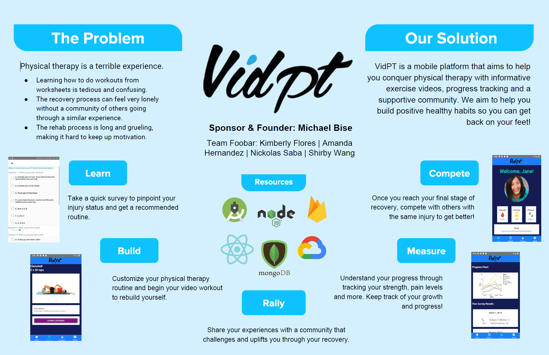
Our team of four designed and developed an app in React Native for our sponsor Michael Bise to help users manage their physical rehabilitation.
Users are able to find their injury, watch informative videos, create an exercise plan, view charts of their progress, and we have plans to make it possible to connect with others to work towards recovery together!
In four weeks, my class partner Mario Gomez and I designed and built a sleep logger where users can input sleep and wake times, sleepiness throughout the day, and view and manage previous entries through a Firebase database.
While we originally planned on a dark theme since users would likely be using it before bed and in the early morning, an Ionic beta bug forced the inheritance of text color and caused white-on-white alerts.
Because of this. we had to make a last minute change in color scheme.
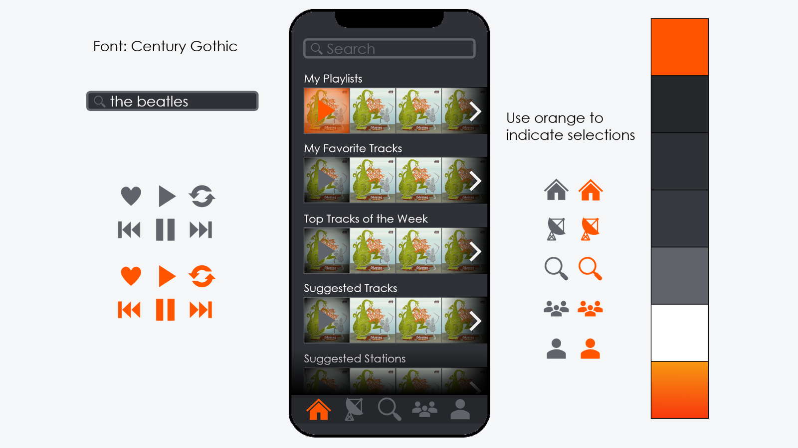
Our team of four was given just two weeks to completely redesign an app.
We chose SoundCloud, as it has a notoriously poor user interface.
I started by creating the style guide shown above so that I could delegate different tabs to each of our team and finish with a consistent looking product.
The Tweet Analyzer was developed in HTML and JS in two weeks and allows you to search Tweets and view and analyze data from an uploaded JSON file.
It also creates Vega-lite charts to help visualize the data.